Writing for Excellence, or even merely good, is one thing. Getting to the essence of the thing is quite another. Essence is about getting to the heart of the matter, the core, pith (and that ith not a mithtyped lithp.) But this post isn’t just another philosophical trope, it’s about marketing!
Everyone ‘knows’ the effort and creativity that must go into writing a book, whether fiction or non-fiction, short or long, narrative or poetry. But few appreciate the creativity and energy that goes into capturing the essence of the opus in the cover so that people might be attracted to it, and buy it.
‘Never judge a book by its cover’ so goes the saying, but if readers never crack the cover, they will never know what they’ve missed. Not everyone will be interested in your book – not their genre, not in their present mood, they’ve already read one of your books and one was enough – but for those who might be interested in the extent of your book, they need to be captured by the essence, and the essence of the book has to be demonstrated, somehow, in your cover. But essence is hard. And so the cover and the blurb are really hard. (There are many other hard things about getting exposure for your book and persuade people to buy it but that will be the stuff of future posts.)
The cover, and the blurb, are crucial to actual readership. How do you make it interesting enough that the prospective buyer (or even borrower) picks it up and looks at it? I am not a marketing specialist, nor a design specialist, but I don’t let that stop me. I have enough knowledge to get me into serious trouble. (Scary thing that MBA.)
To begin with, the cover needs to have something about it that gets the attention of the the prospective buyer’s scattered mind already working hard to screen out massive amounts of data. The paradox of information overload – there’s so much information streaming into the brain that there ends up being almost none registering. In Jungian terms this may be even more acute for those with a Perceiving preference – they’re so busy with the Perceiving function they have limited capacity for Judging. They go to the mega-bookstore, spend many minutes, or even hours browsing, and come out empty-handed. Maybe that’s why many of us go shopping with a list in hand.
Anyway, back to the shopper browsing the bookshelves. If your book is actually displayed, you, the author, have a much better chance of the browser stopping to pick it up. Whatever is on the cover has to capture the viewer’s attention, directly or subliminally: the title, the illustration, the colour, the font style and colour.
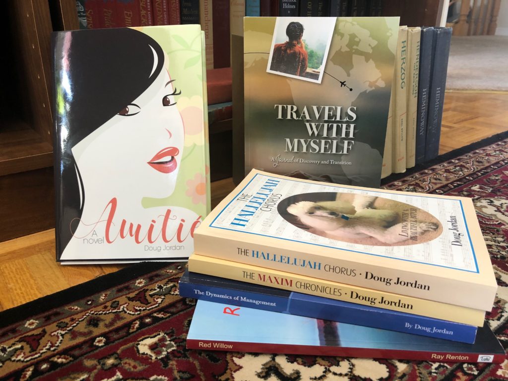
Everybody knows sex sells, or at least gets attention, so if your cover can stimulate the amygdala in some way and the Browser picks up the book, you’ve got to first base at least, so to speak. But how do you bring sex into a book cover about dogs? Or of a 12 year old boy? (Well actually, in The Hallelujah Chorus there are some provocative sex scenes but those were mostly included as clinical discussions, if perhaps tongue in cheek; and in The Treasure of Stella Bay there is a love interest between Alex and Sandra, innocent pre-pubescent kids. But really, do I want to suggest, subliminally or otherwise, sex in the cover of the book?)
(Amitié, A novel is a love story and the cover sought to evoke mystery and a certain sex appeal. Despite this, hardly anyone has seen the cover and so the take-up has been slight indeed.)
Beyond sex, there are other subliminal messages to be conveyed in the illustration (or elsewhere in the cover design) and these must still address the problem of capturing essence of the story in the illustration. The Maxim Chronicles illustration tried to capture a masculine proud canine, a worthy competitor for the show ring, and possibly a bit willful for his intimidated family. The photo on the cover of The Hallelujah Chorus depicts a sweet and intelligent, attentive poodle – surely everyone would want to know more about this lovely dog?
The cover of Travels With Myself tried to answer this question of essence by providing a map and a flight path halfway around the world. There was also the image of a woman, intended to raise questions (and another on the back cover as well) but also an image of a tombstone – not very sexy.
There are other elements of cover design designed to capture attention and provide essence: colour, title and font design. Of course much of this is subjective – what is appealing to one is terrible to another. Generally, the cover’s colour should be primary, bright and inviting. This is especially true if the Browser has only the spine of your book to pick out from a sea of spines on the shelf. If the book is intended to be bright and cheerful, then a bright and cheerful colour should be chosen; if the story is dark and sinister, perhaps a dark colour is best, but people tend to avoid dark colours, unless they like them – think goths.
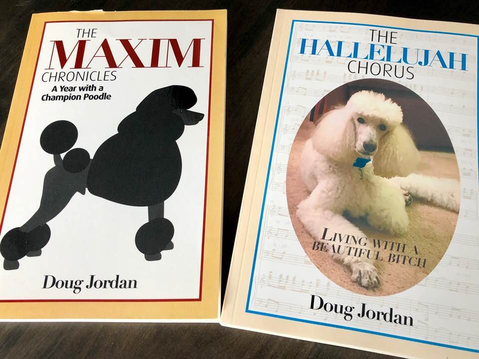
The cover forThe Maxim Chronicles is a warm yellow, almost caramel, framing a bright white interior, and then the black graphic image of a standard poodle in show coat. Strong red name (Maxim) in the title and a thin red border. Red attracts attention, but needs to be used sparingly so that it doesn’t send the message, Stop.
The Hallelujah Chorus cover is a softer, creamy yellow to suggest a gentler, feminine, subject than the masculine Maxim. The white background with the subliminal image of the actual sheet music for Handel’s Hallelujah Chorus sets up the title (pure genius don’t you think?!?). The robin’s egg blue for the title and the thin border were also echoes of The Maxim Chronicles cover, and idiosyncratic echos of real life: Max’s collar was red, Halle’s was light blue.
The title of a book is almost always conceived with the cover in mind, the ultimate essence, a very short invitation to open the book. I’m pretty happy with the titles of my books. I didn’t struggle with any of them, in fact, it seems to me I had the titles before I had written ten words of the text. I’m of course delighted with The Hallelujah Chorus and I am particularly happy with the titles Travels With Myself, and The Treasure of Stella Bay.
Then we have the problem of font choice and design. Who would think font matters?, size too, but it does. Big enough, bold enough, striking enough, reflective enough of the style of writing inside. But not too bold, too striking, too modern/abstract, too distracting. I’m fond of serifs; sans serif fonts are, to me, sterile even if efficient (think Helvetica, think Swiss!), whereas serif fonts are elegant, artistic (think Palatino – named after the 16th-century Italian master of calligraphy Giambattista Palatino). Research has also shown that people find sans serif fonts tiring after a while, serif fonts are restful to the eye and allow the reader to keep reading, though this may be irrelevant in a three word title! Despite this knowledge of the utility of fonts my decisions on The Maxim Chronicles and The Hallelujah Chorus, are a mixture, with no particular rationale in mind but contrast.
And then we come to subtitles. Sometimes they are useful, most times they are unnecessary – usually used by academics with too much to say or just trying to be clever. Consequently all of my books have subtitles. A Year with a Standard Poodle was an obscure attempt to echo Peter Mayle (See, this book is going to be funny.) Living with a Beautiful Bitch was of the ‘too clever’ variety (and even got me into trouble with the Facebook censors). I resolve to have no subtitle for The Treasure of Stella Bay.
And now we come to the ultimate ego trip for a cover – the author’s name! If you are famous celebrity, and/or an already successful published author, 37 weeks on the New York Times Best Sellers’ List, your name is likely to be prominent on the cover. The publisher likes it that way, name recognition helps sell more books. If you’re a modest indie published author (new term for self-published) you shrink a bit from making your name too prominent. But dammitall, you put a lot of time, energy, effort and creativity into this opus, take pride in it. But not too much. My brand is Doug Jordan, in serif font!
If the front cover has done its job the Browser picks up the book and turns it over to consider, the back cover, and the second hallmark of essence – the blurb. The illustration on the front may be the primary come-on – does the picture speak a thousand words? Does it raise curiosity, questions, in the Browser’s mind and prompt him/her to turn the book over and look at the back, and read the blurb?!
Ah yes, the blurb – the ultimate precis, the attempt to capture the whole story in a few lines, to coax the browser into opening the book, and try a few lines therein, to carry it to the cashier, or virtual shopping cart, and swipe, or click.
I think I’m a decent writer, even good, occasionally good to great. But writing that blurb is hard. Major publishing houses have small armies of blurb writers distilling your 77,000 words down to a pithy 27. But if you are self-published, how do you describe your baby in 27 words? Well, she’s blonde, looks like her mother, … After many hours of noodling and writing, and scrapping, and thinking some more, writing and re-writing, and re-writing, I finally settled on something – the pressure to publish pushes you to make a decision. And once you see the final product on the cover, doubt sets in again – maybe we should have said it this way. But it’s too late. Sometimes when it comes to essence the standard of excellence is, ‘good enough’. If the Browser actually bought a copy of the book, the blurb did its job.
In our next post we will take this marketing discussion a bit further and talk about promotion, and reviews!
Doug Jordan, reporting to you from Kanata Ontario
© Douglas Jordan & AFS Publishing All rights reserved. No part of these blogs and newsletters may be reproduced without the express permission of the author and/or the publisher, except upon payment of a small royalty, 5¢.